Project Overview
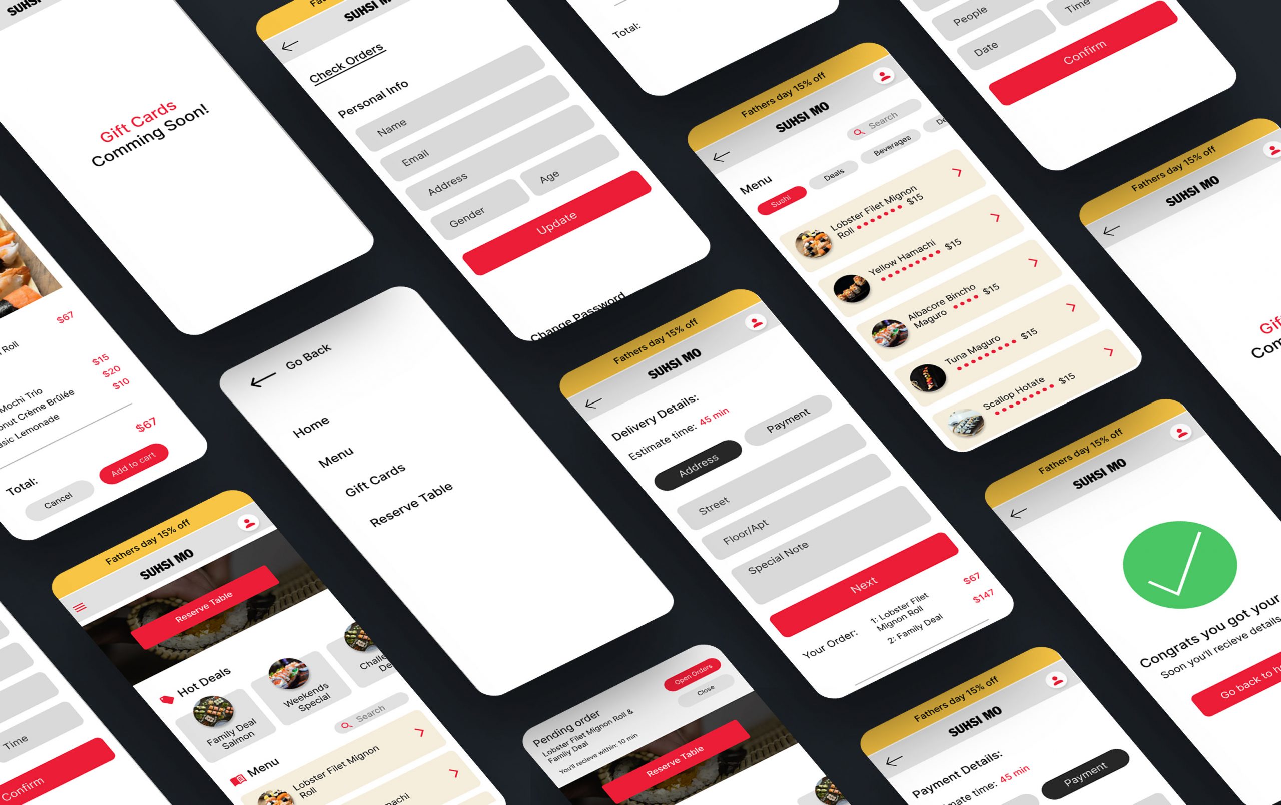
SushiMo is a sushi app for those who love Japanese food. Foundational, Design, and Post-launch research conducted to build the SuhsiMo app.
The Problem
Not easy to add big orders and exclude items from the menu. It’s hard to find apps with special note options so that users can write chef notes about their allergies. There’s no way to check your order status except by calling the restaurant.
The Goal
SushiMo’s goal is to provide an easy-to-use app with the option to add big orders in seconds and give the best user experience. Users can write a special notes on individual dishes. After checkout, the order status shows on the top of the phone.
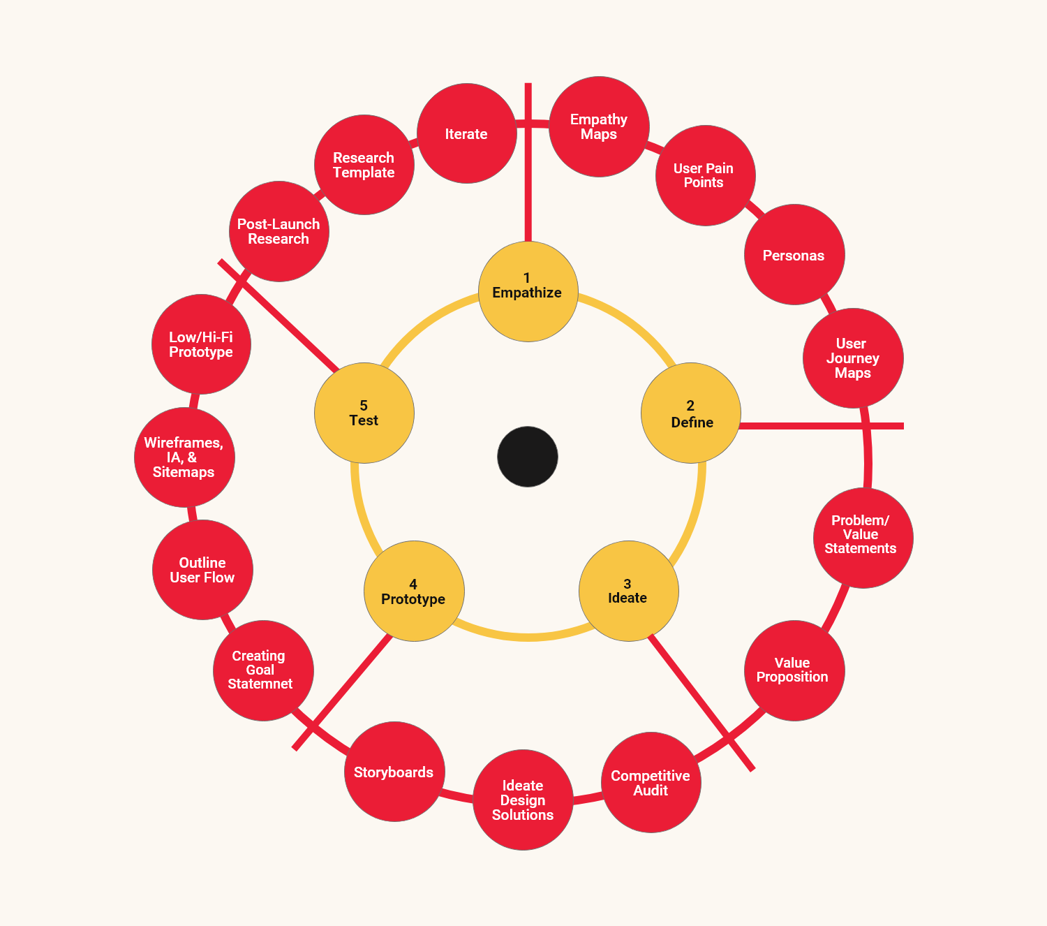
Scope of Work: UX Design Process
Pain Points
Time
No way to track the order or get the estimated time for delivery.
Payment
Hard to find food apps that support cash on delivery.
Menu/Health
Afraid to get dishes that contain allergic ingredients.
Accessibility
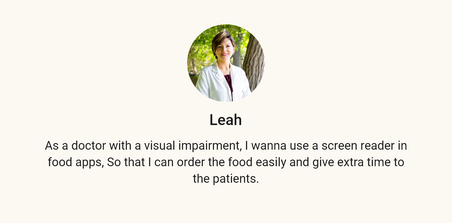
It’s Confusing to order without a screen reader.
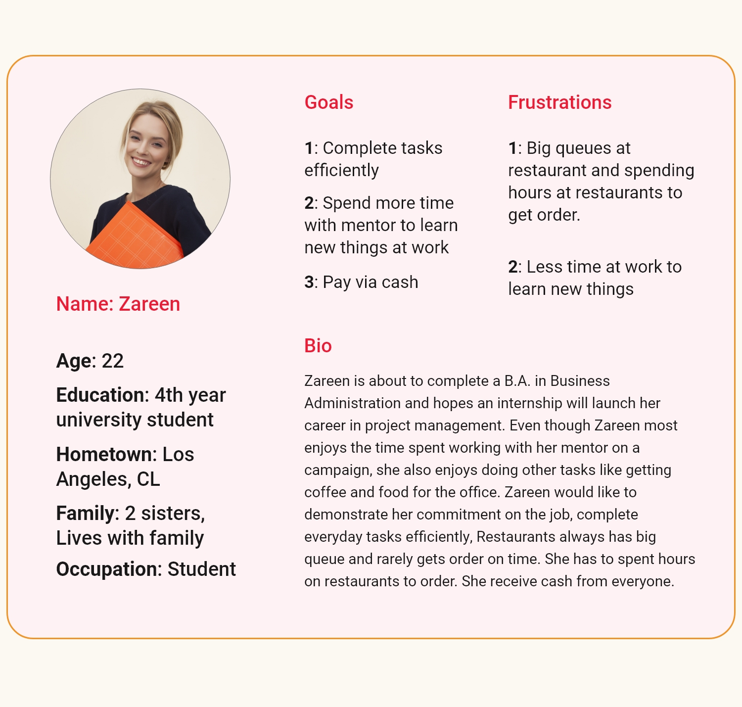
Personas

User Stories

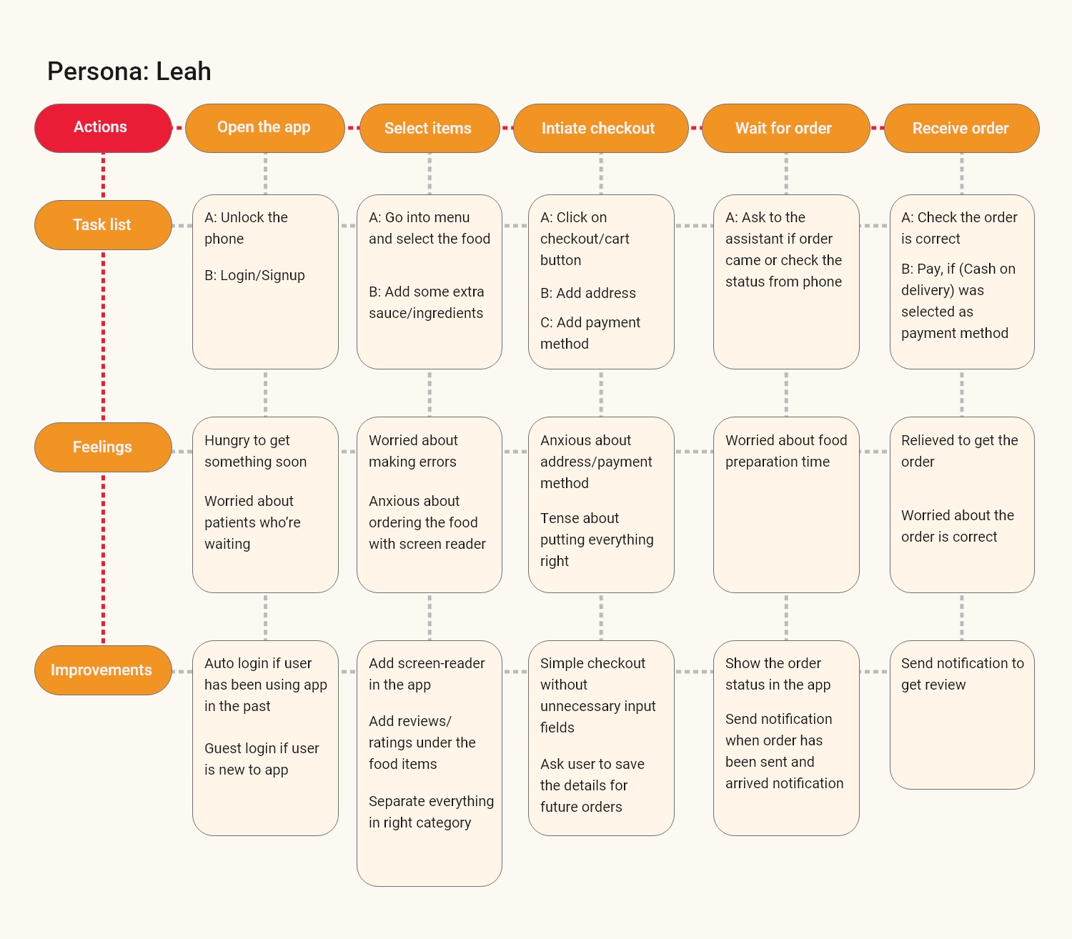
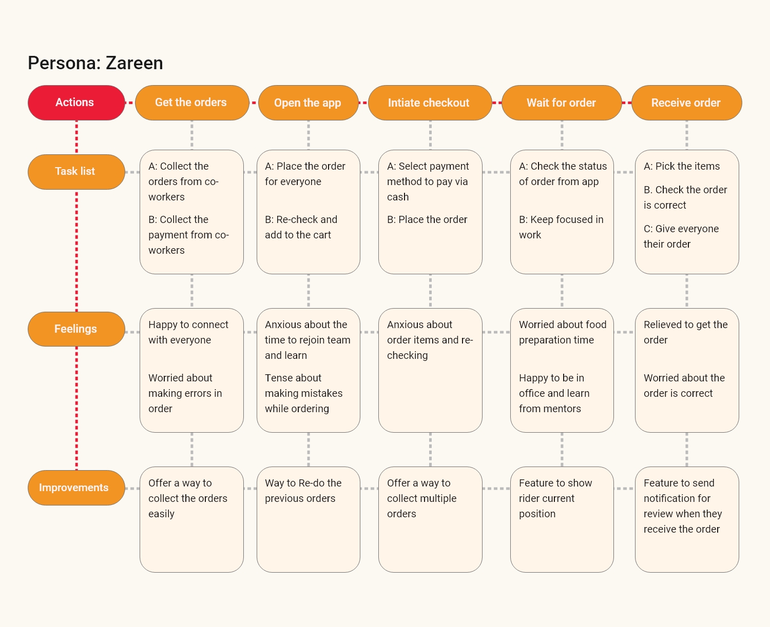
User Journey Map
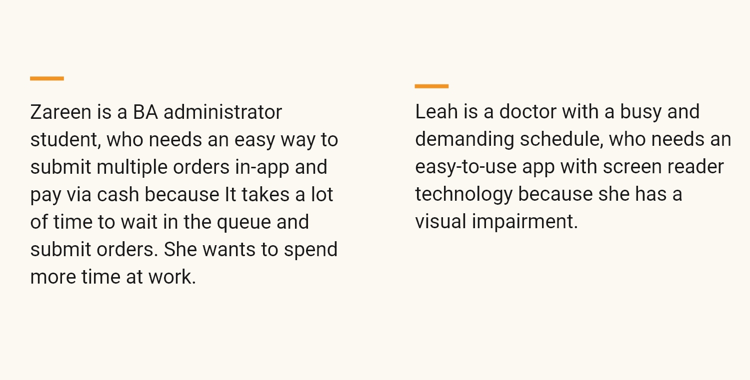
Problem Statements
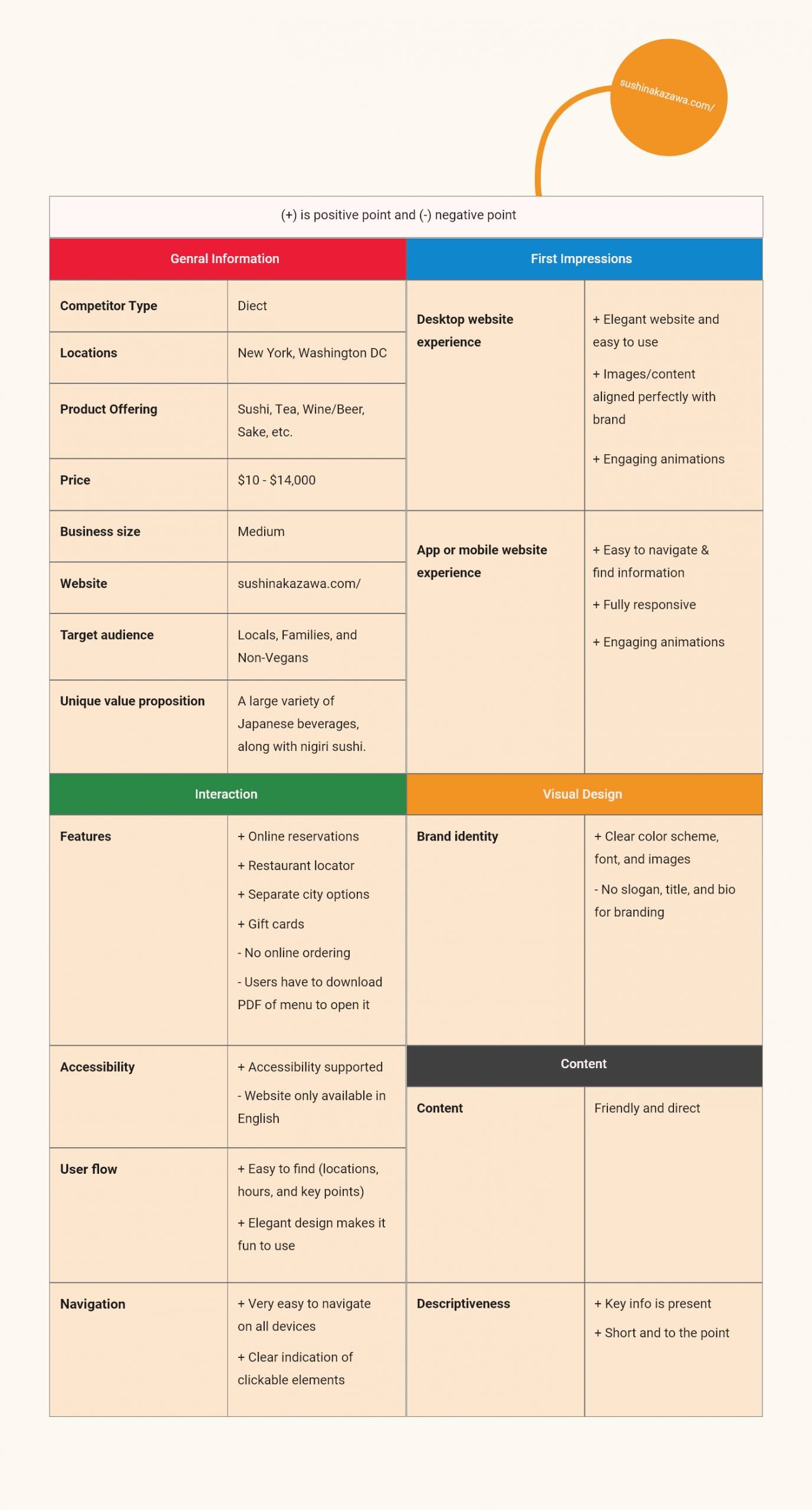
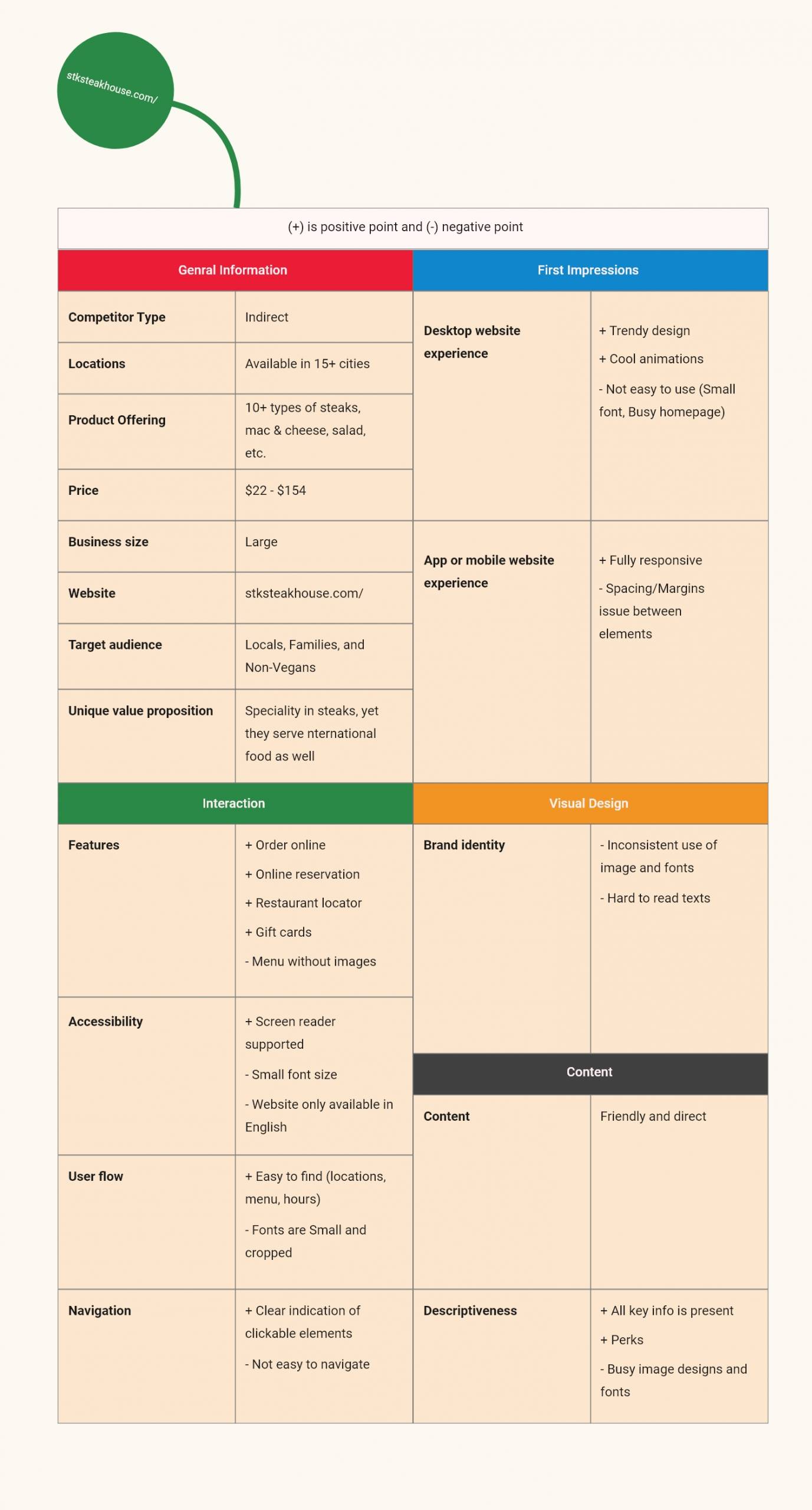
Competitive Audit
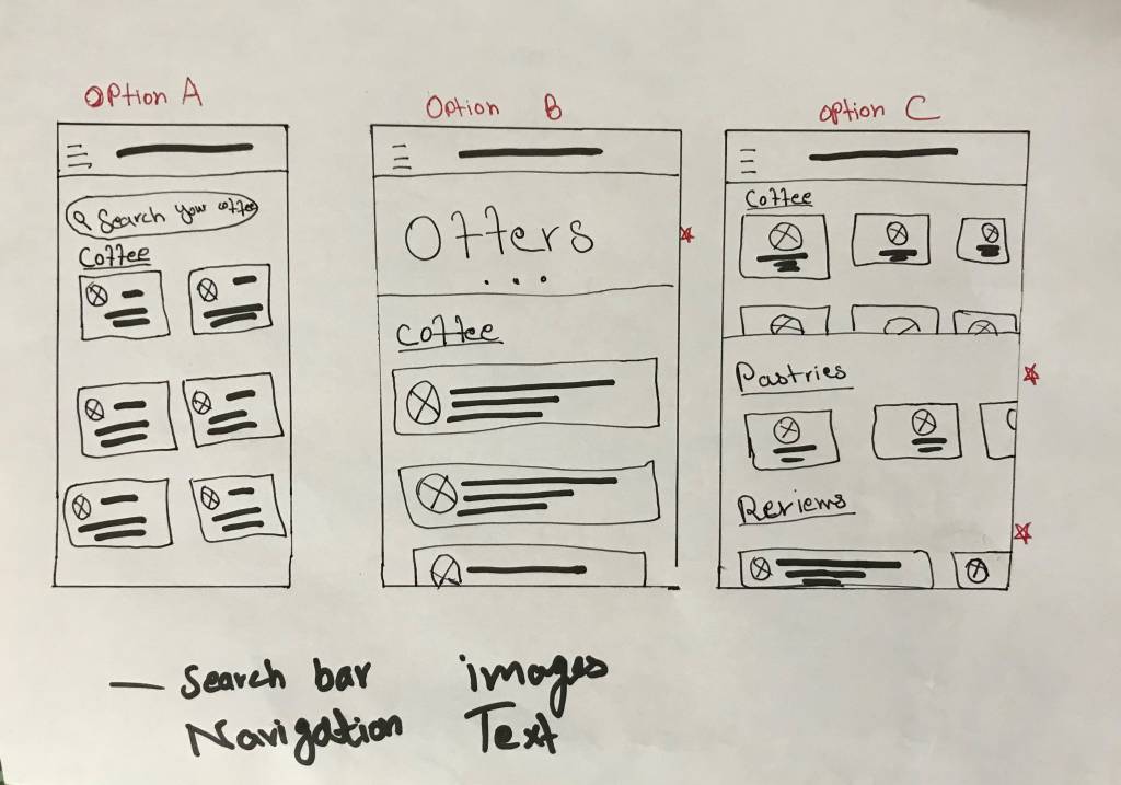
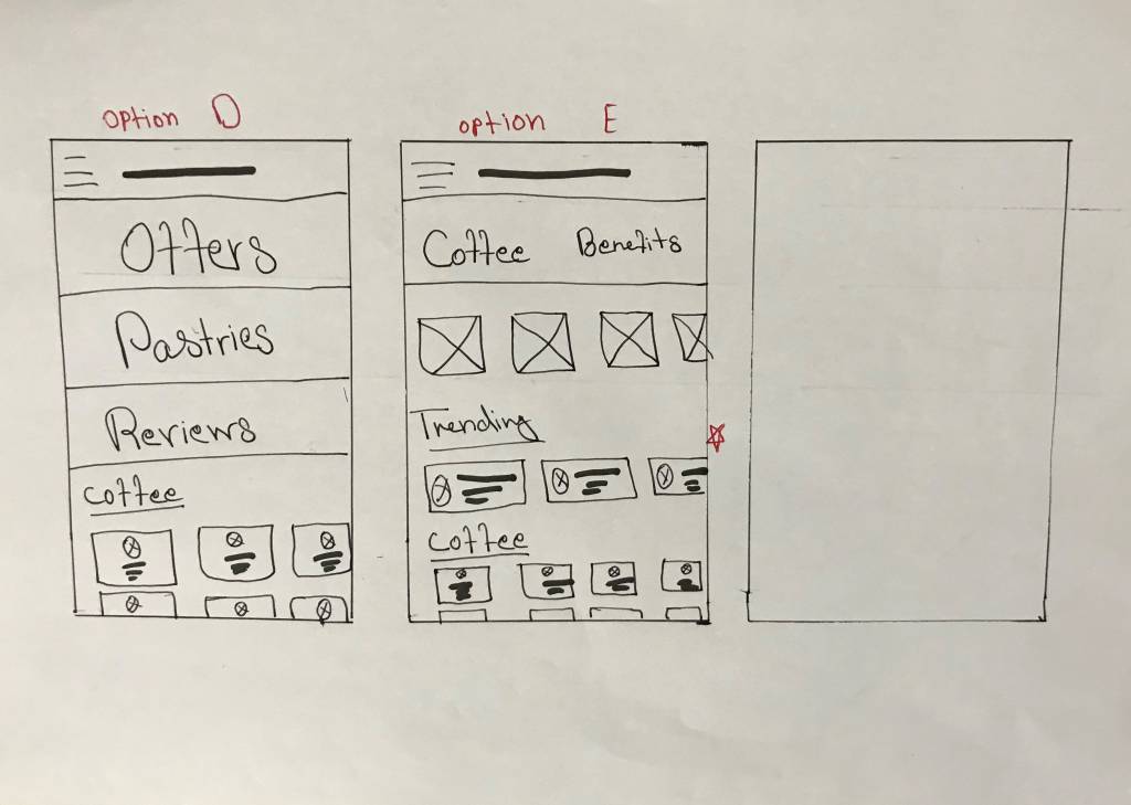
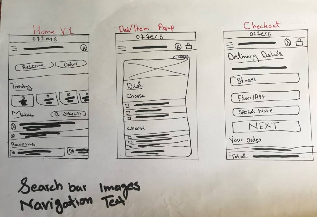
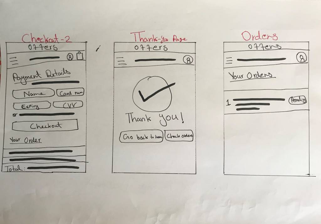
Paper Wireframes
Taking the time to draft iterations of each screen of the app on paper ensured that the elements that made it to digital wireframes would be well-suited to address user pain points. For the home screen, I prioritized a quick and easy way to order the food and check the status
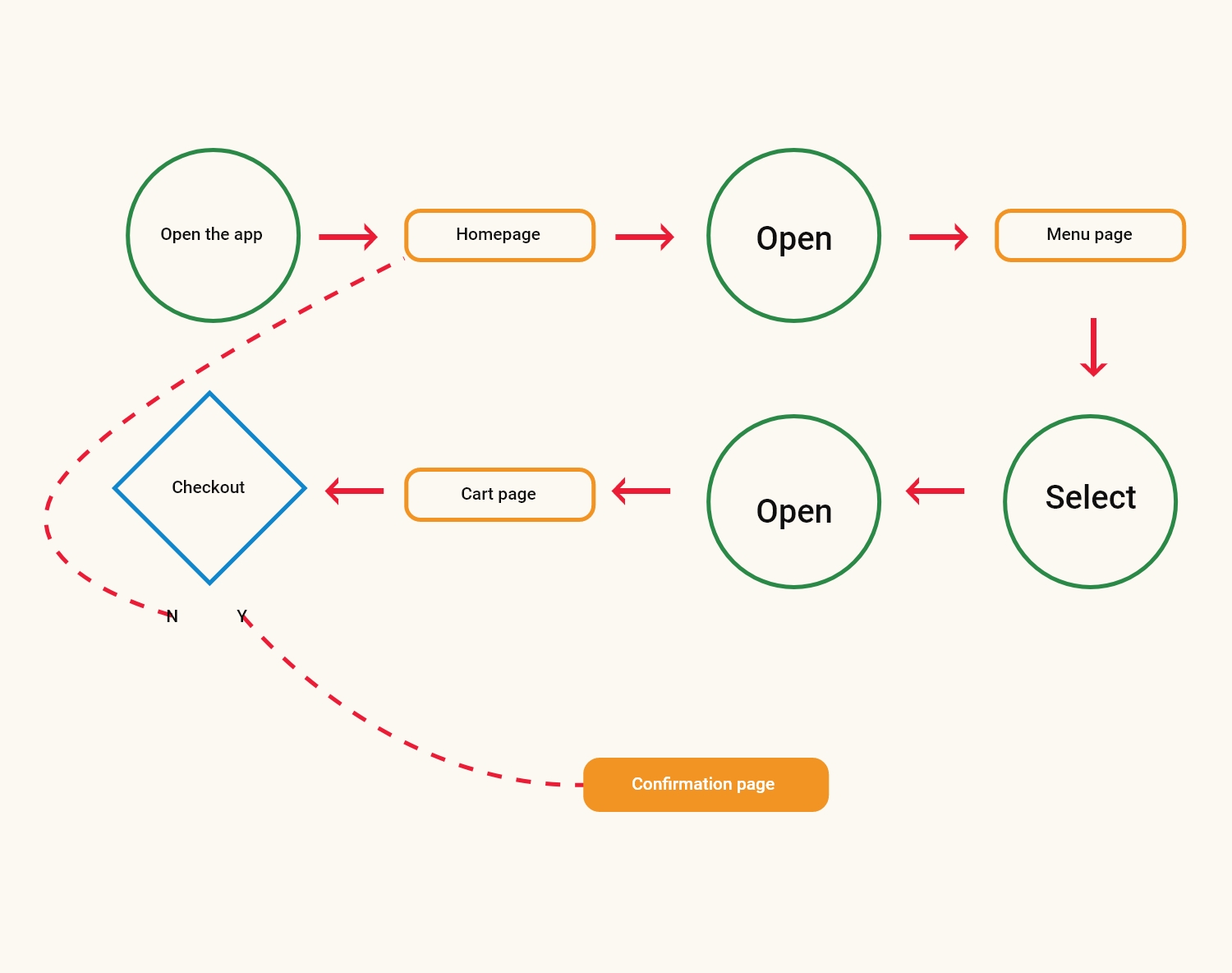
User Flow
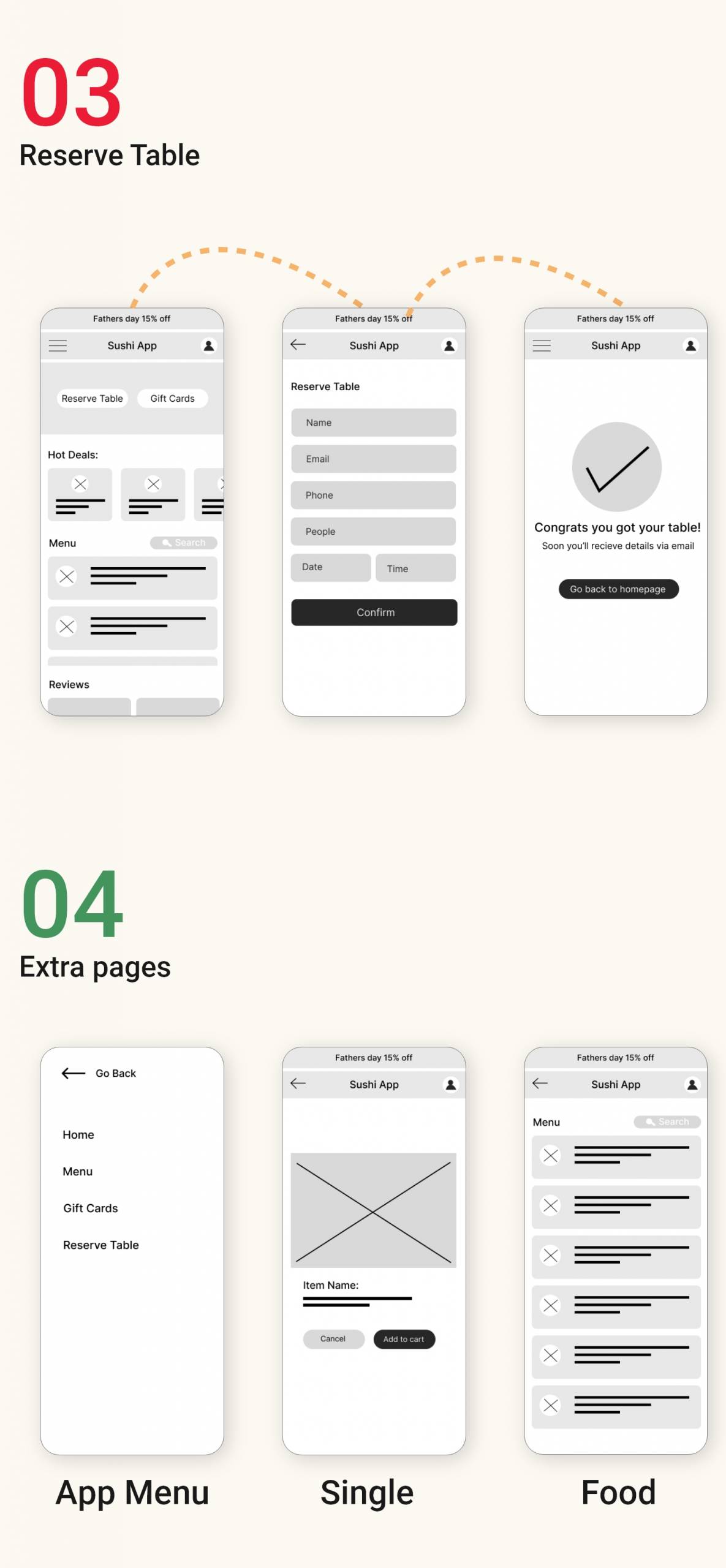
Digital Wireframe & Low-Fi Link

Low-Fidelity Prototype Link
Usability Study: Findings
I conducted two rounds of usability studies. Findings from the first study helped guide the designs from wireframes to mockups. The second study used a high-fidelity prototype and revealed what aspects of the mockups needed refining.
Round 1 findings
- Users want to know about discount deals
- Worried to get cold food while ordering
- Get the option to pay via cash on delivery
Round 2 findings
- Need individual food menu page
- Easy way to check orders status
- Accurate estimate time
Mockup & High-Fi Link

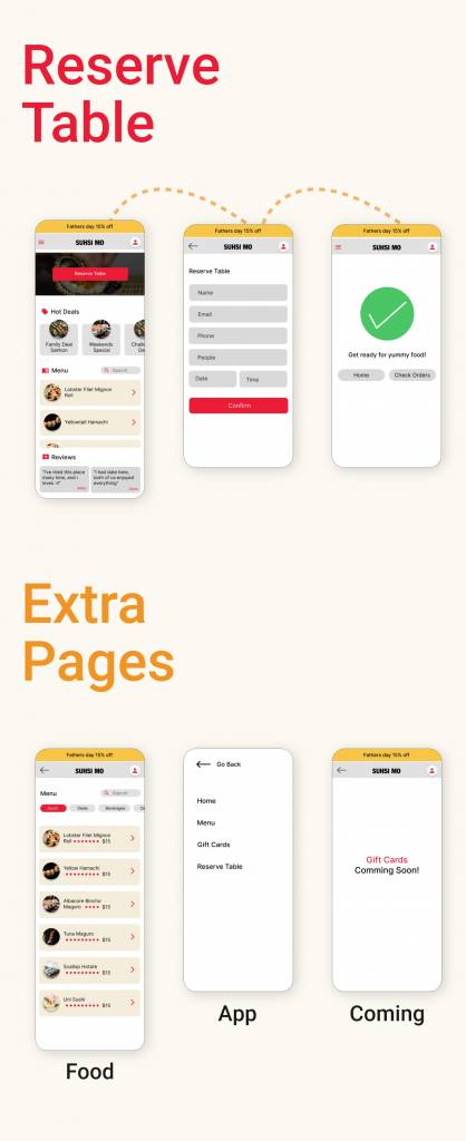
Hi-Fidelity Prototype Link
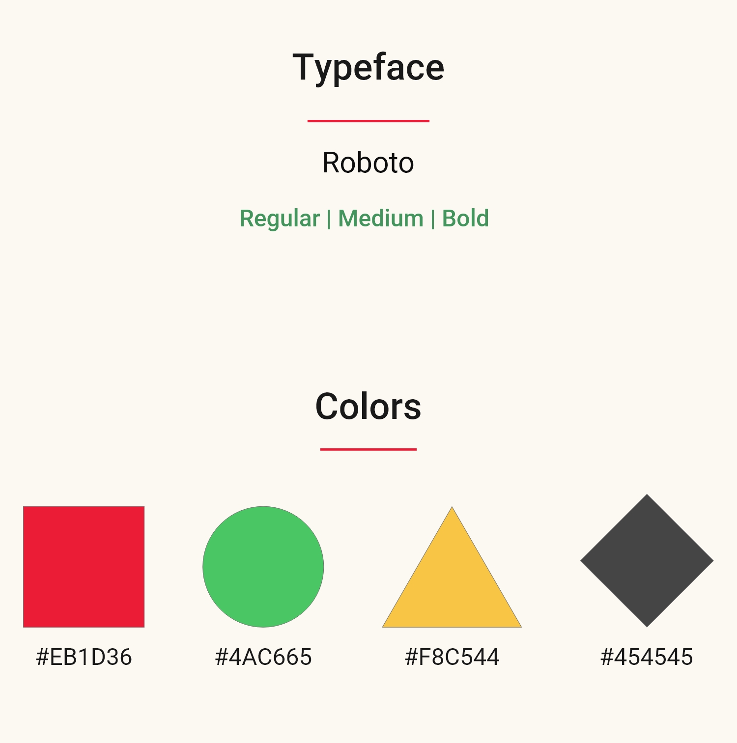
Typeface & Colors
Accessibility Considerations
Provided access to users who are visually impaired by adding alt text to images for screen readers.
Used icons to help make navigation easier and more appealing.
Used detailed imagery for sushi and beverages to help all users better understand the designs.
Takeaways
Impact
The app makes users feel like SushiMo really thinks about how to meet their needs.
What I Learned
While designing the SushiMo app, I learned that there should not be any biases when you research or conduct usability studies. There’s a lot to learn from peers, friends, and family when you send your app to them to test. It takes time but is worth it.


