Project Overview
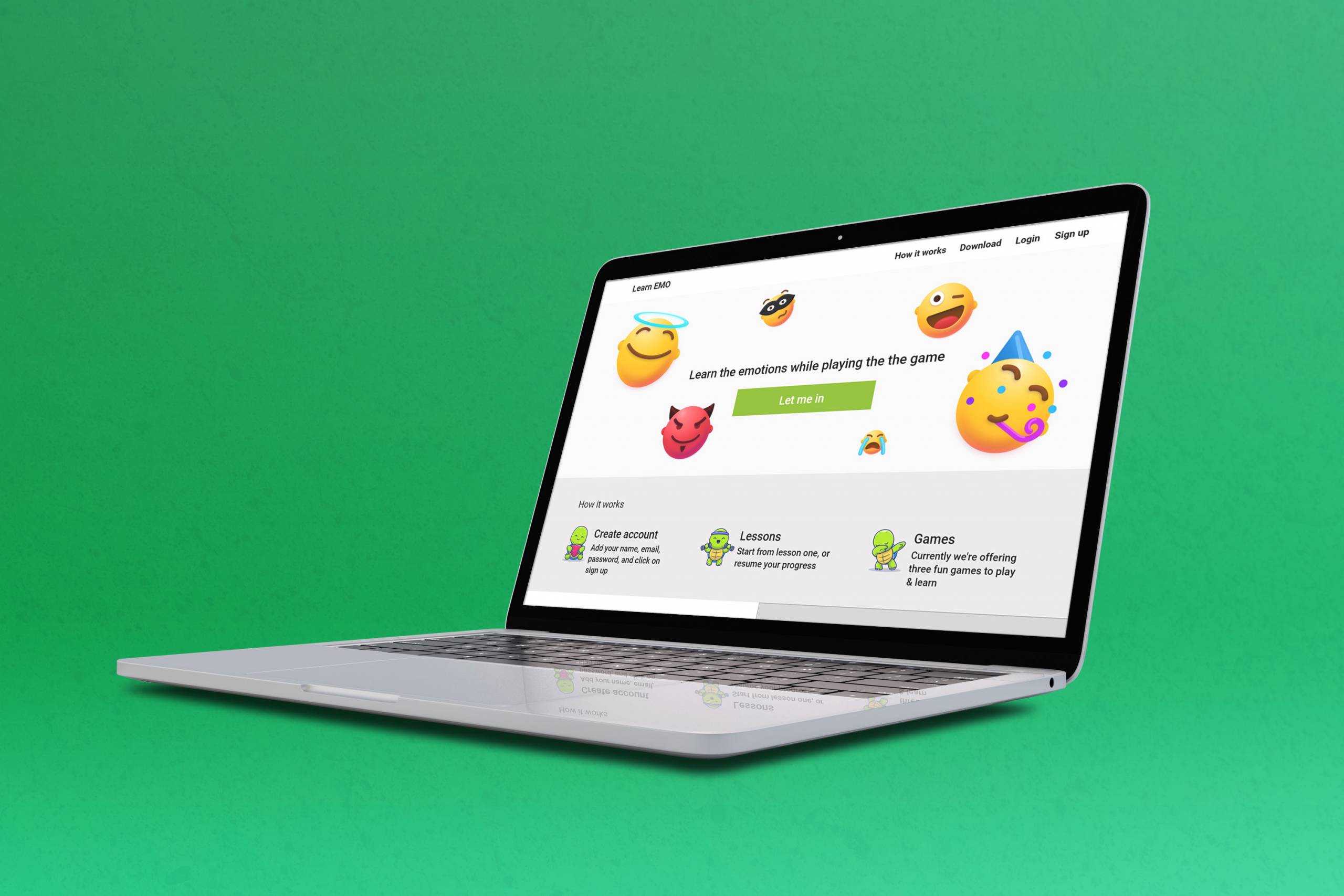
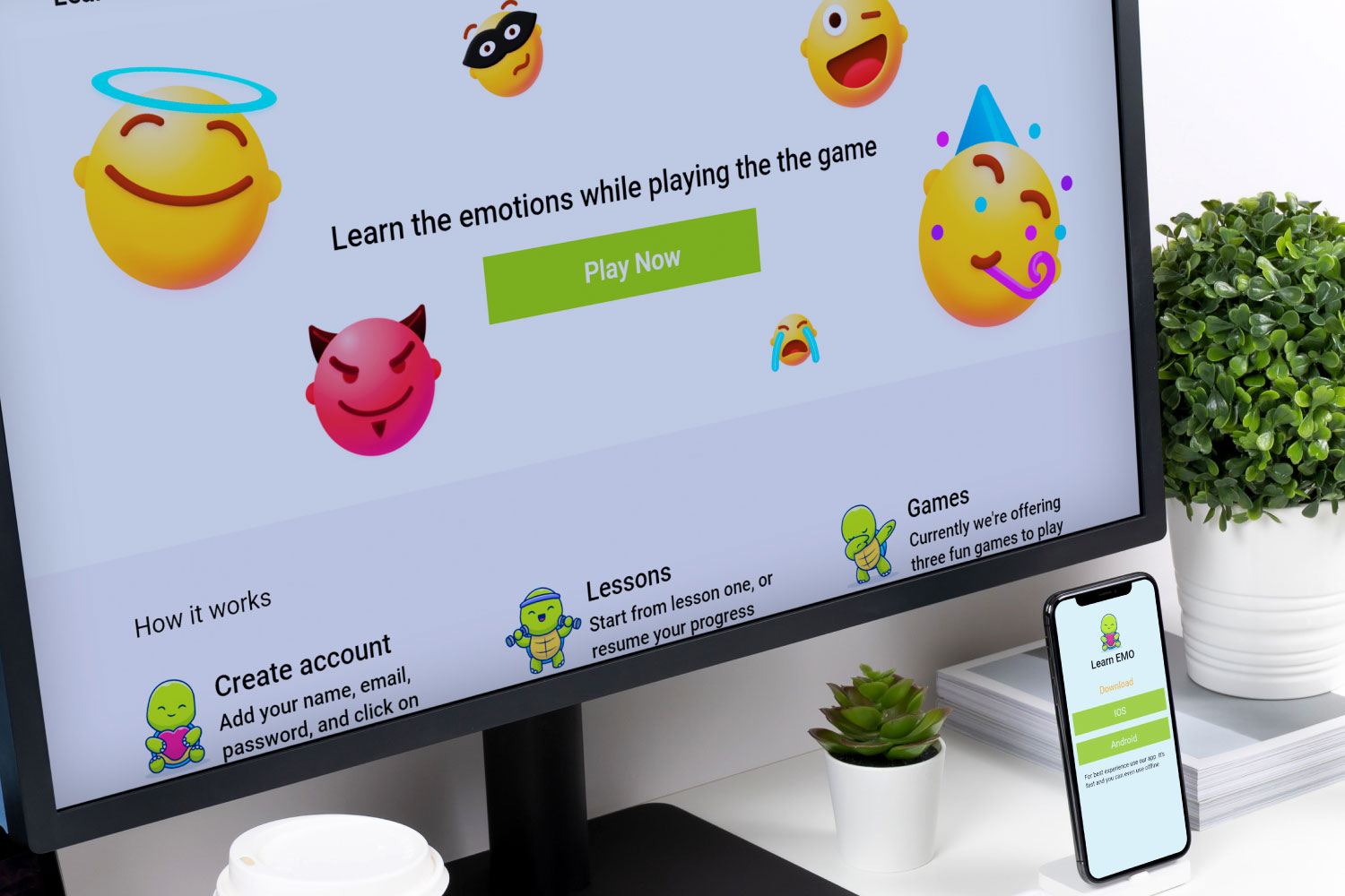
Learn EMO is a cross-platform tool for kids to learn emotions and express their feeling in a more open way. It offers lessons and three games that make this platform more fun. Super easy to learn emotions with infographics and it supports all devices.
The Problem
Parents and teachers want an effective way to teach children about emotions, and most children can’t read
The Goal
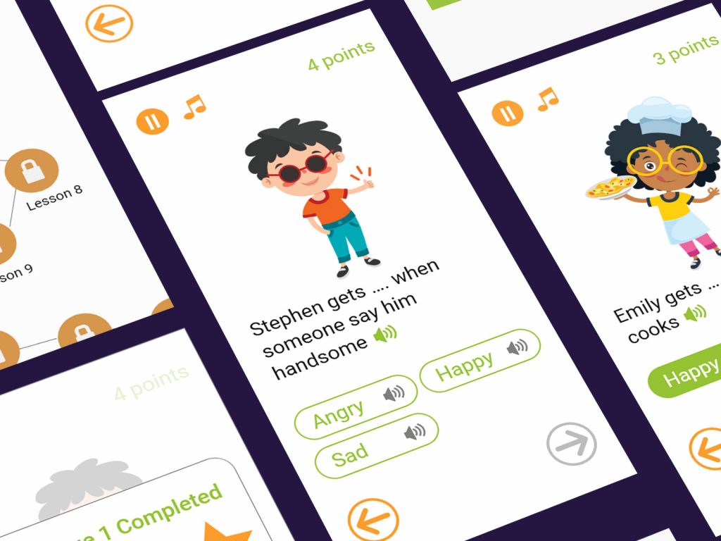
The Learn EMO helps children learn emotions in a creative way. Completing challenges, and playing games. Children who can’t read can listen and learn
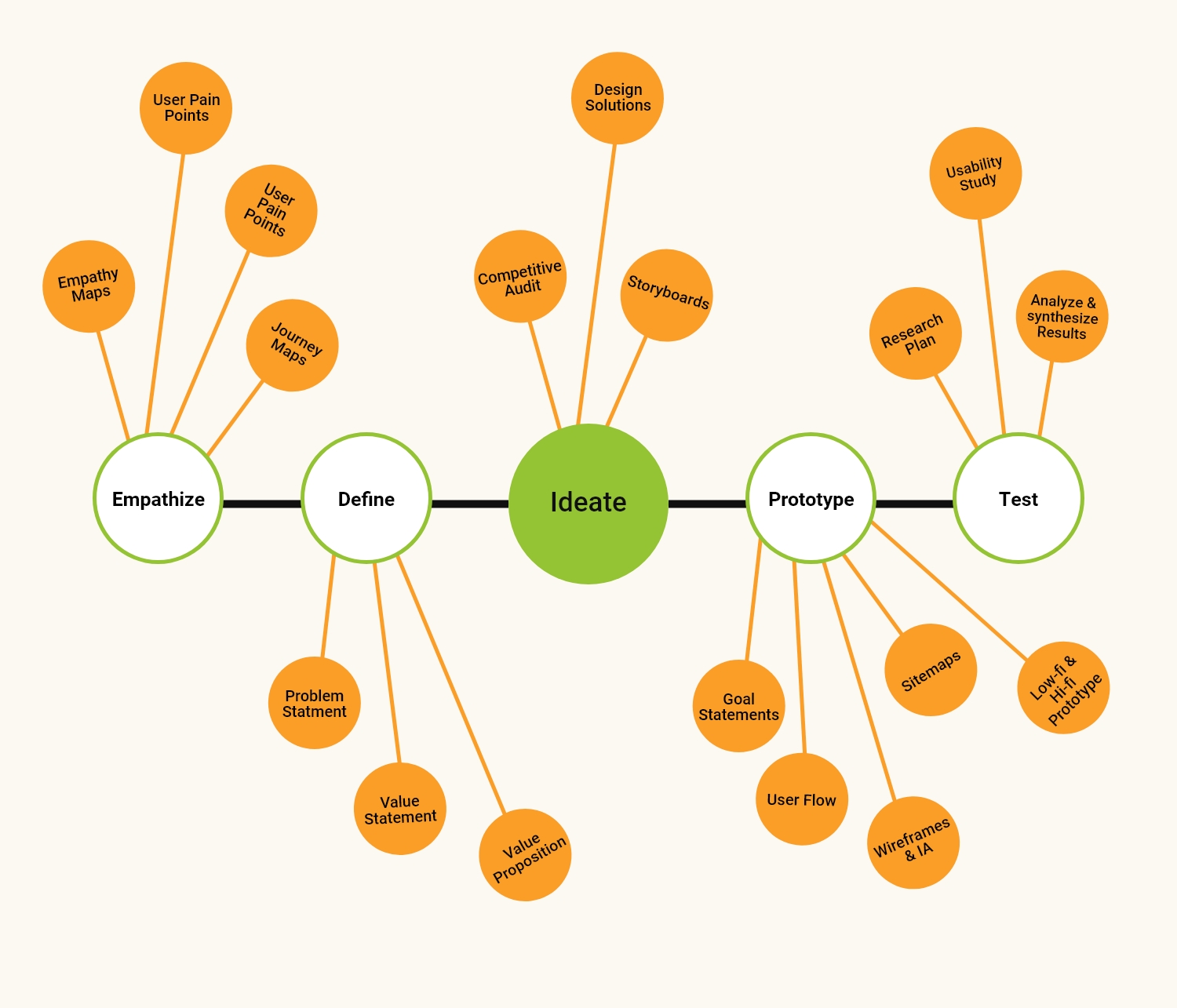
Scope of Work: UX Design Process
Pain Points
Infographics
Apps don’t support infographics
Learning with fun
There aren’t apps on the market that support effective and fun methods for children
Cross-platform
It’s pain in the head to use apps on different devices. It shows a black screen and some apps don’t support sound on the phone
Accessibility
There’s no app that supports read aloud feature
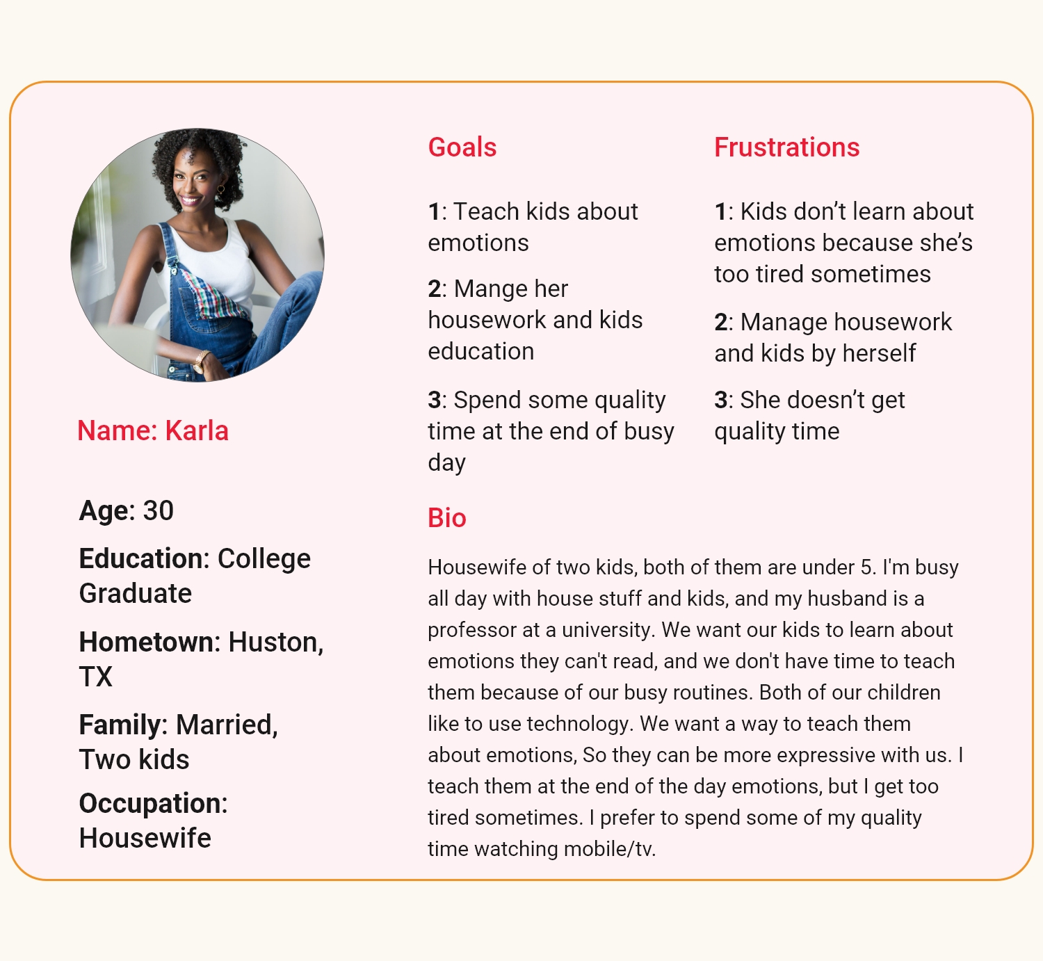
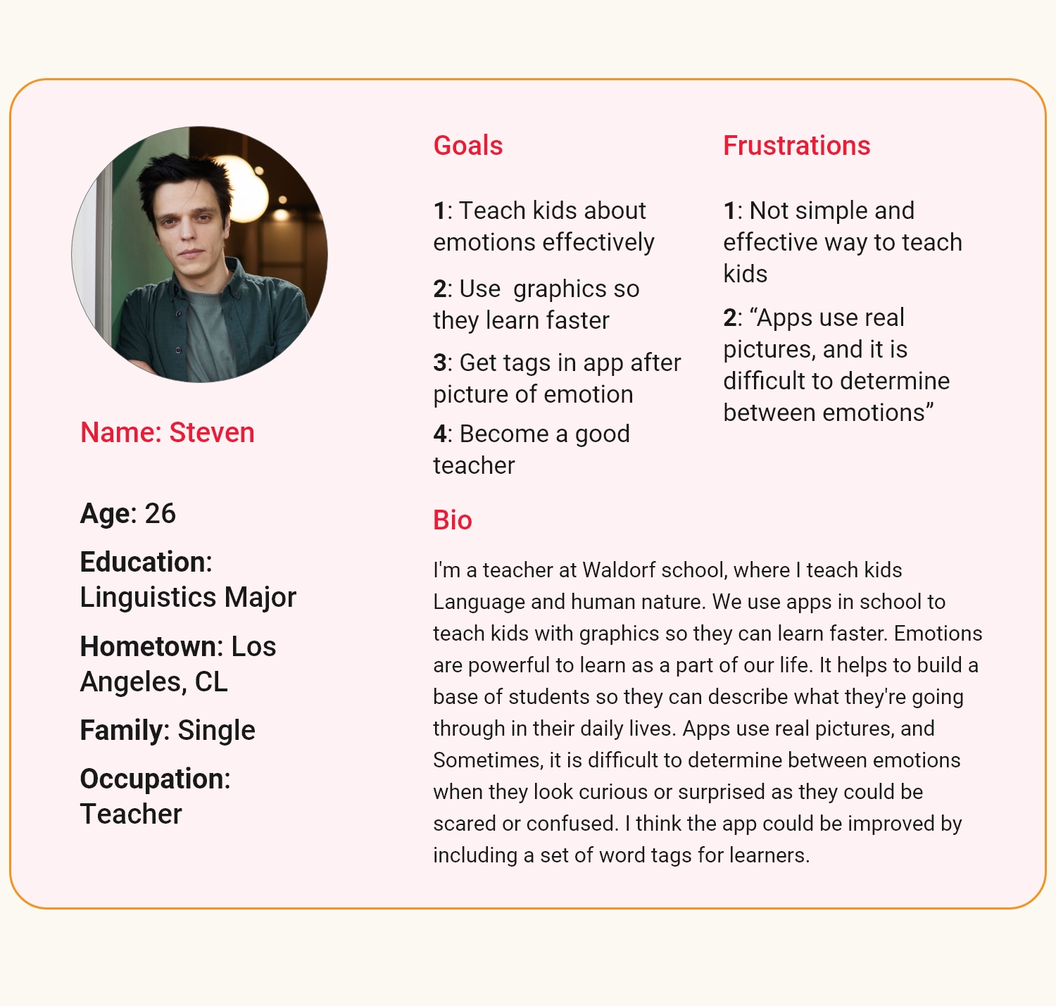
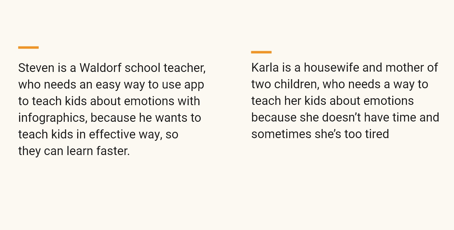
Personas
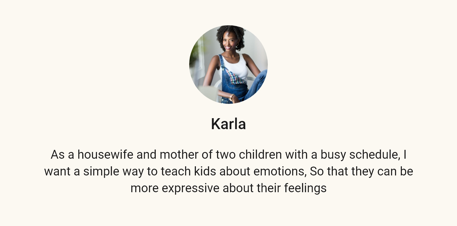
User Stories

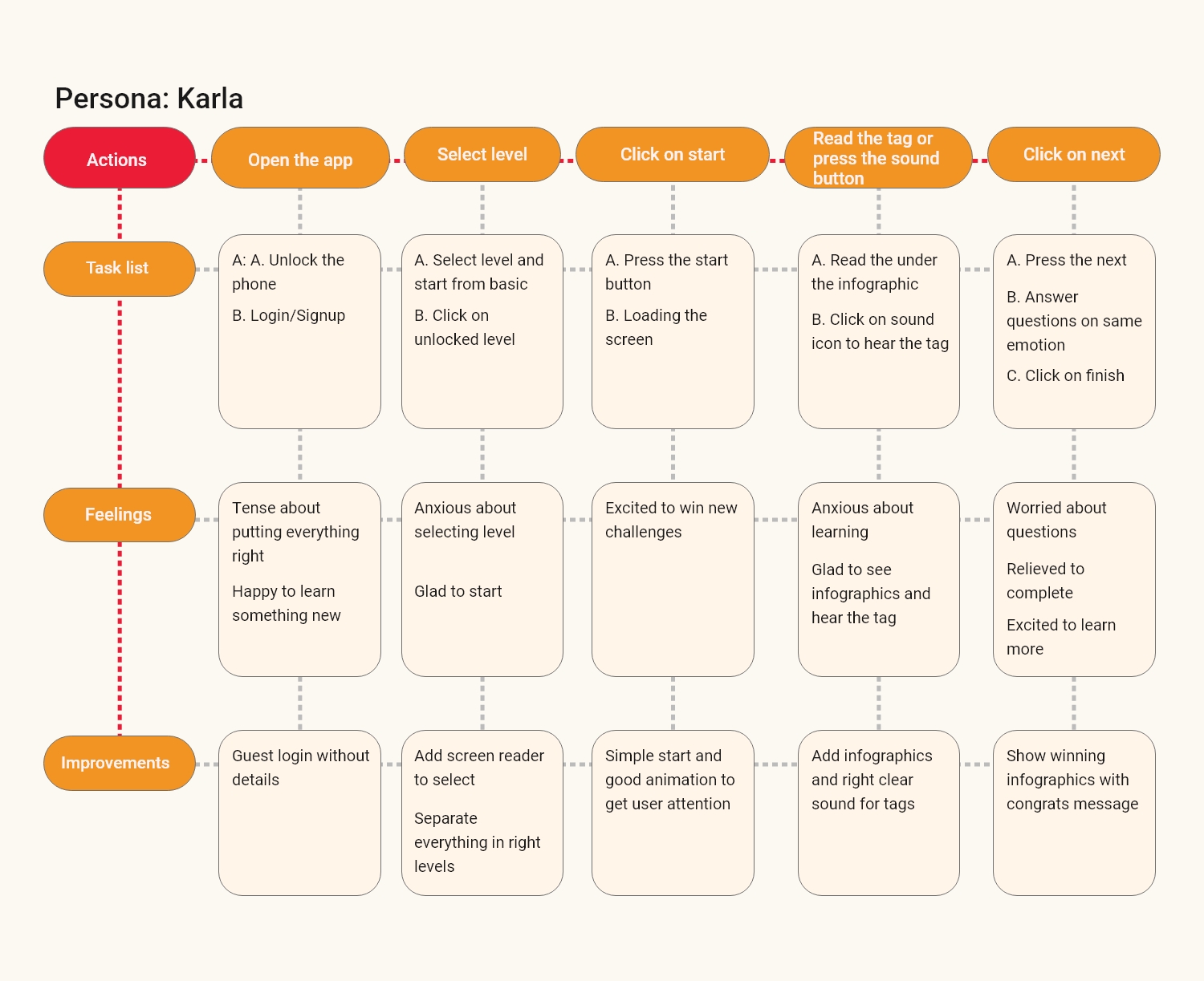
Journey Map
Problem Statements
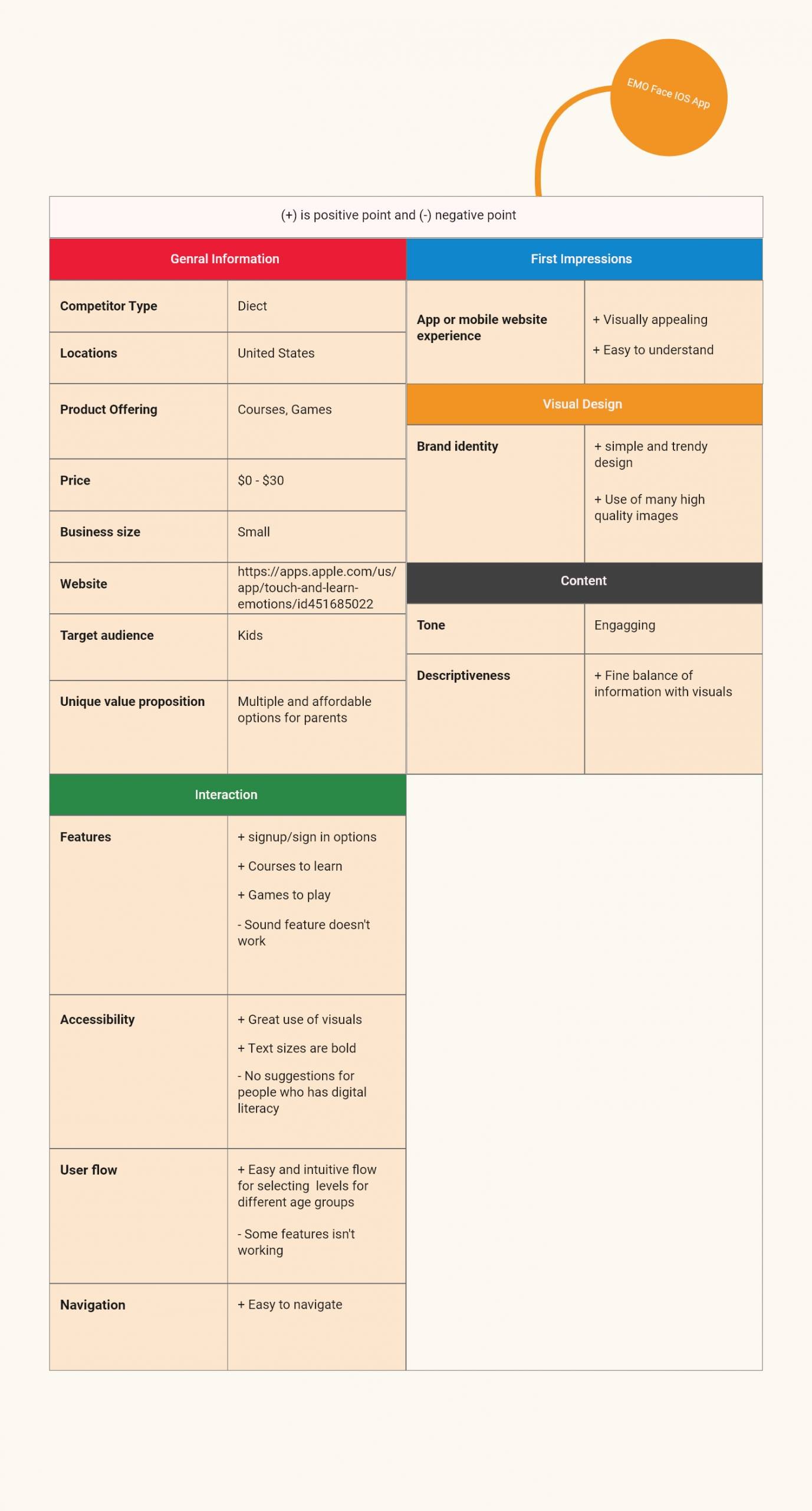
Competitive Audit
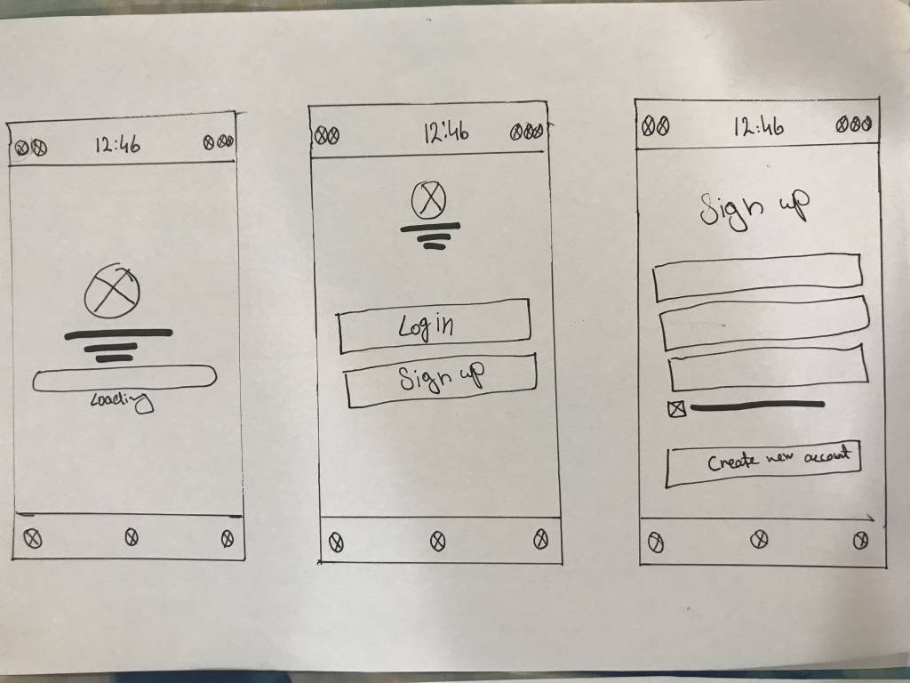
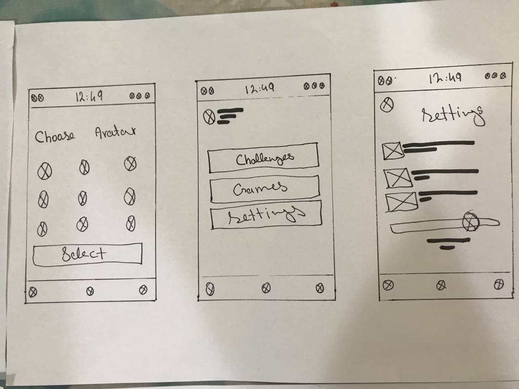
Paper Wireframes
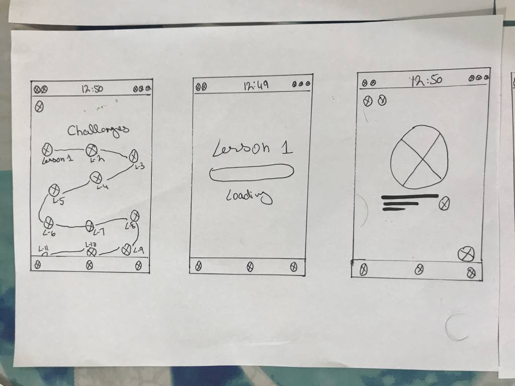
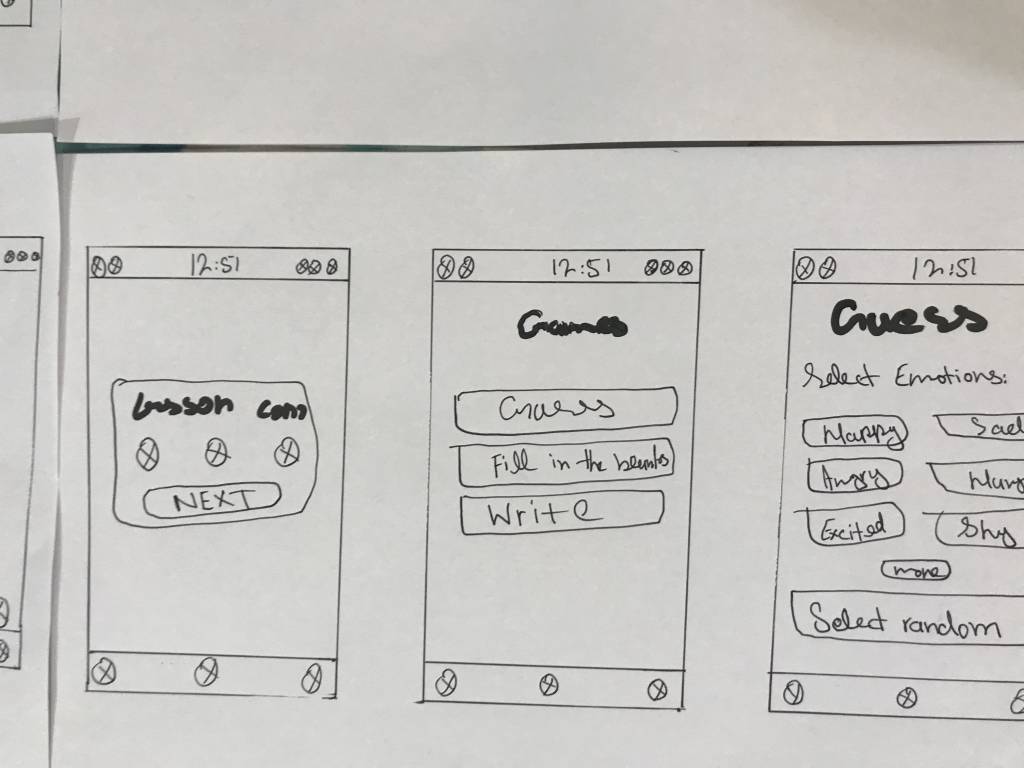
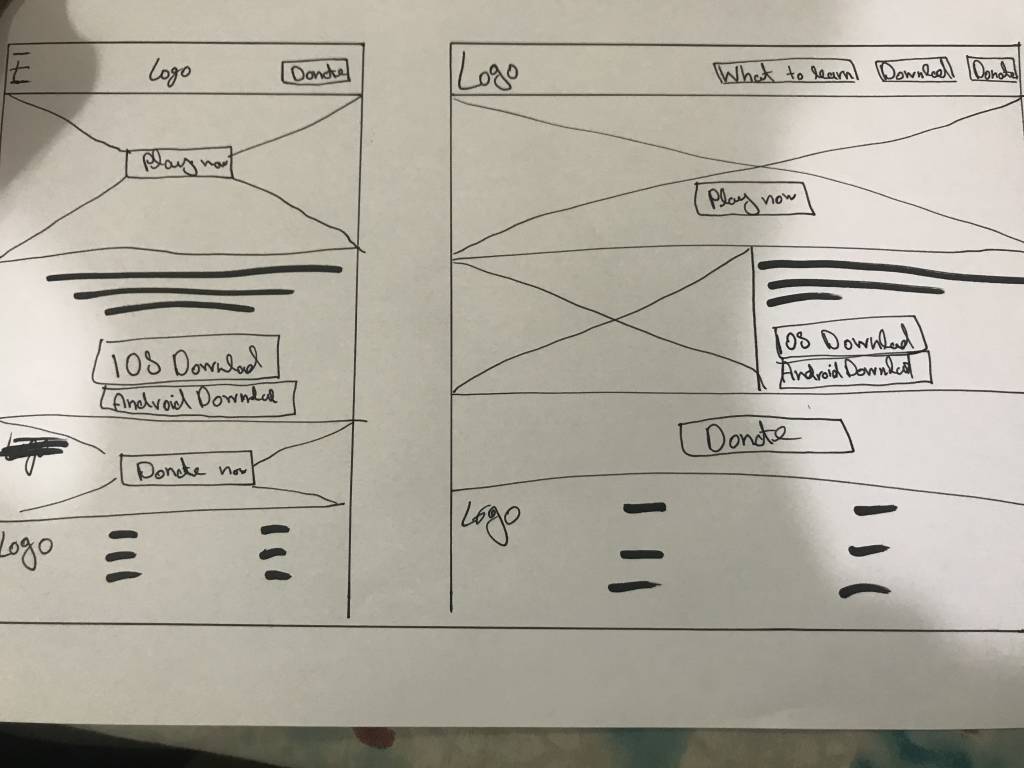
Taking the time to draft iterations of each screen of the app on paper ensured that the elements that made it to digital wireframes would be well-suited to address user pain points. For the home screen, I prioritized a learning process to help children learn effectively with a good user experience
Digital Wireframe / Low-Fi Prototype
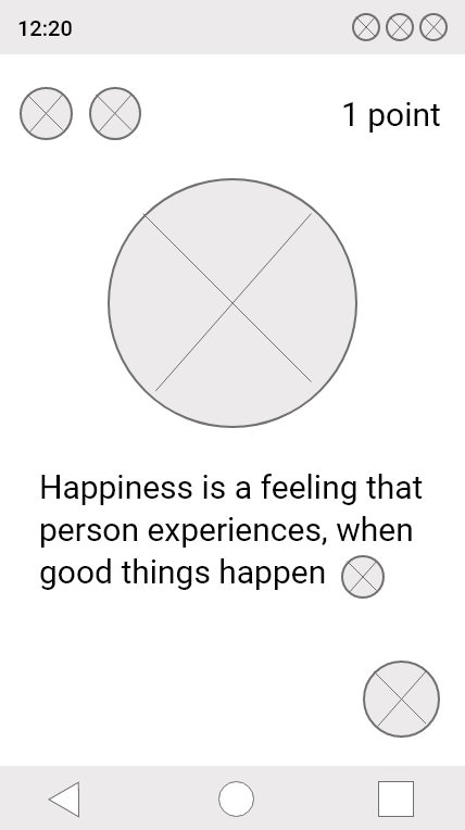
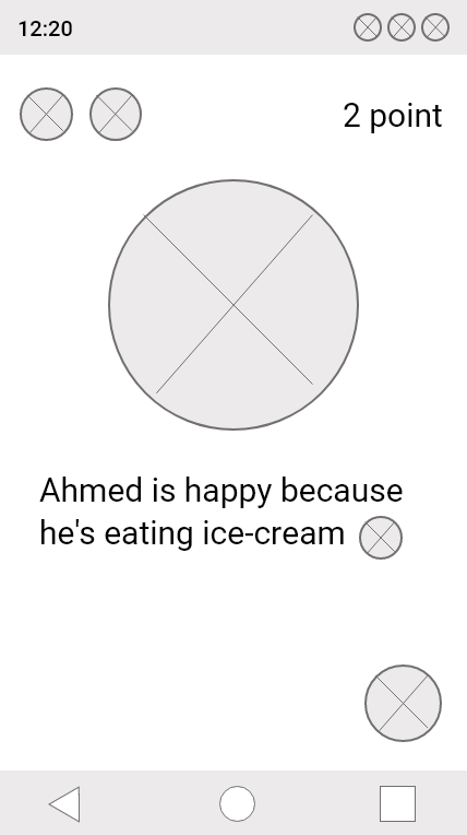
Using the completed set of digital wireframes, I created a low-fidelity prototype. In the primary user flow, I connected challenges and games, so the prototype could be used in a usability study.
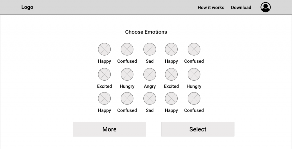
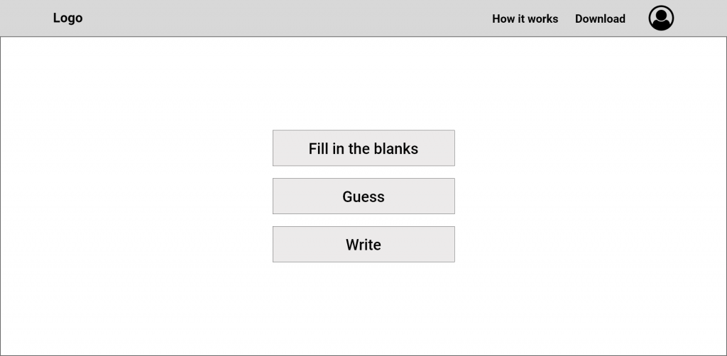
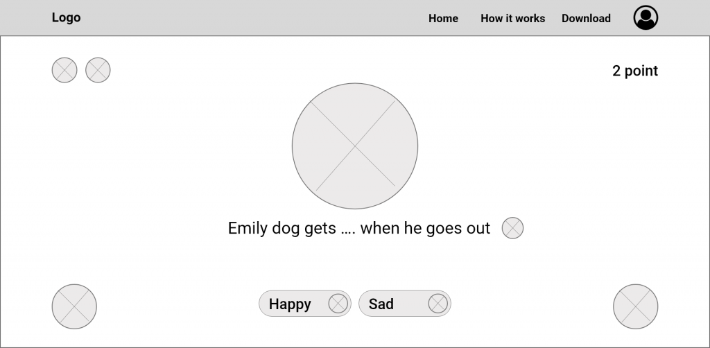

Web Low-Fidelity Prototype Link
Phone Low-Fidelity Prototype Link
Usability Study: Findings
I conducted two rounds of usability studies. Findings from the first study helped guide the designs from wireframes to mockups. The second study used a high-fidelity prototype and revealed what aspects of the mockups needed refining.
Round 1 findings
- Creative and simple homepage
- Challenges to complete
- Speak loud option
Round 2 findings
- Infographics on learning pages
- Added games
- Re-write some names as (Challenges to Lessons)
Mockup / High-Fi
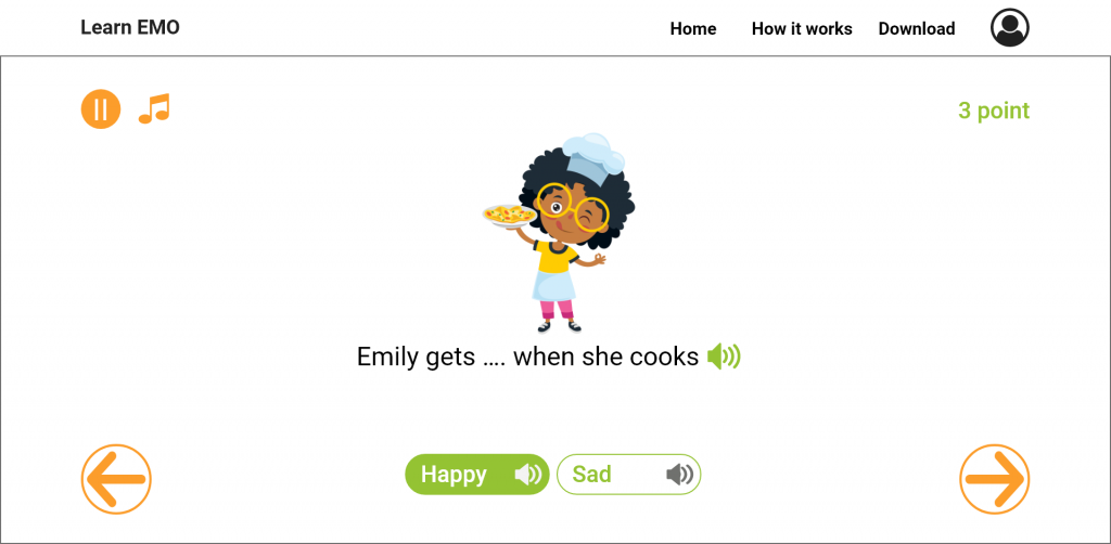
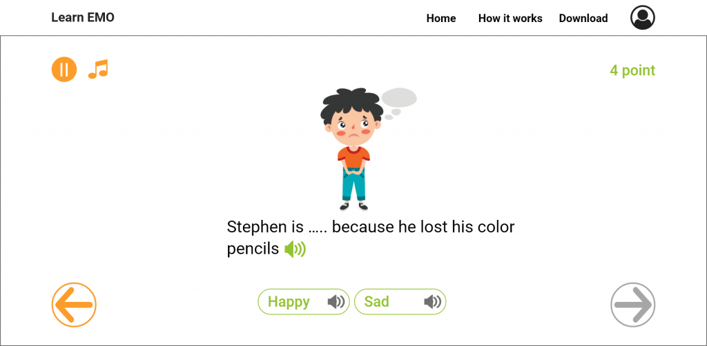

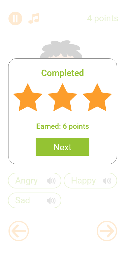
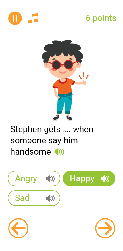
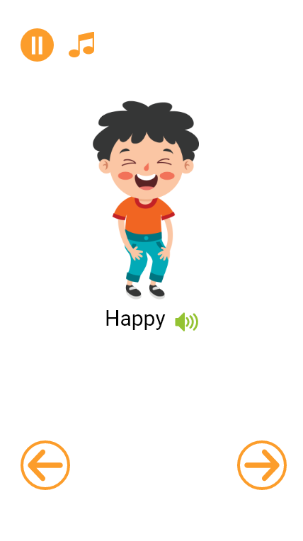
Website Hi-Fidelity Prototype Link
Phone Hi-Fidelity Prototype Link
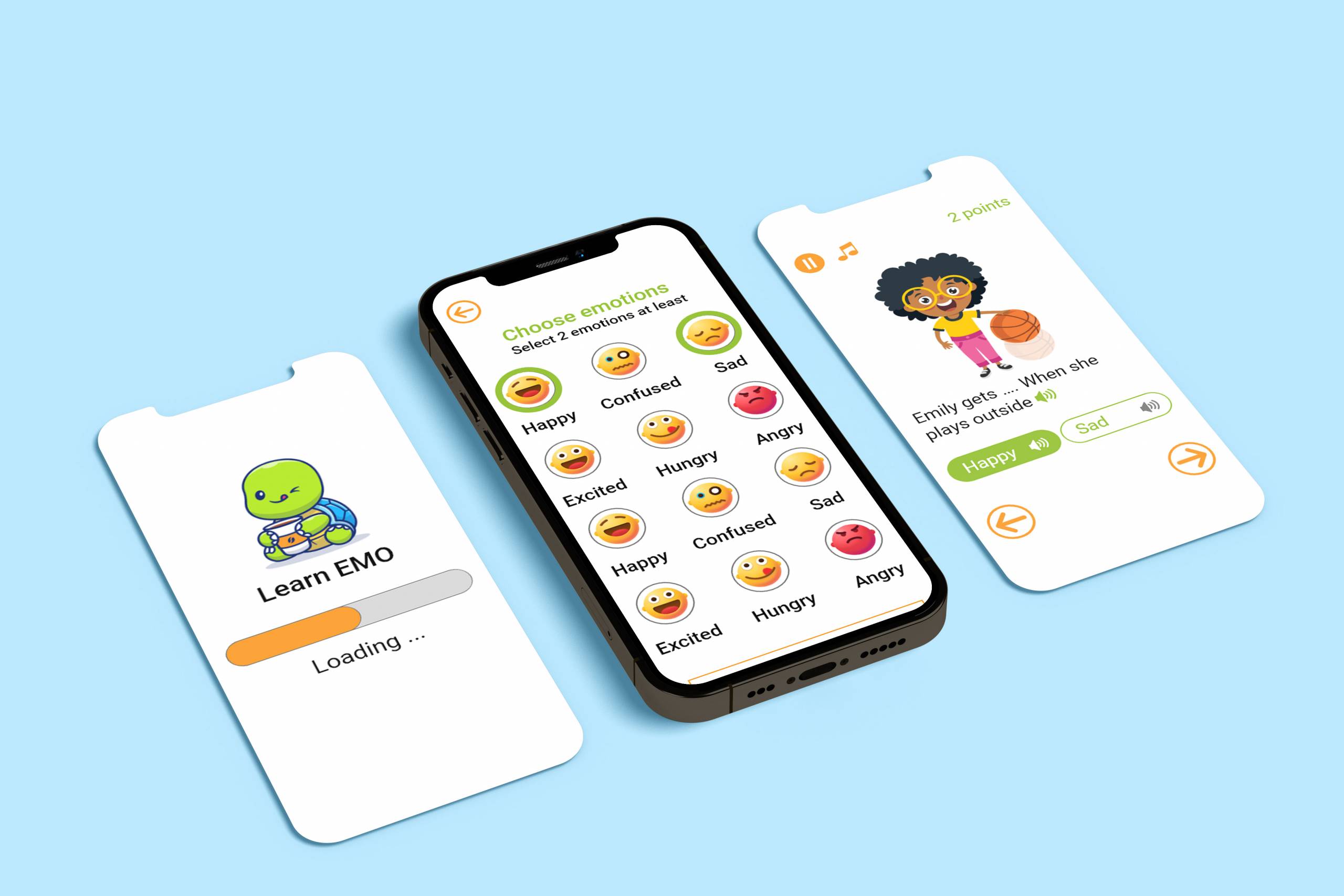
Accessibility Considerations
Provided access to users who are visually impaired by adding alt text to images for screen readers.
Used icons and infographics to help make navigation easier and a productive learning experience
Used detailed imagery for materials, and added designed to help all users better understand the designs.
Takeaways
Impact
Learn EMO made it easy for children to learn emotions in a fun way while playing games or taking lessons both offer interesting infographics.
What I Learned
While designing the Learn EMO cross-platform, I learned that there should not be any biases when you research or conduct a usability study. There’s a lot to learn from peers, friends, and family when you send your website to them to test. It takes time but is worth every bit of it.
